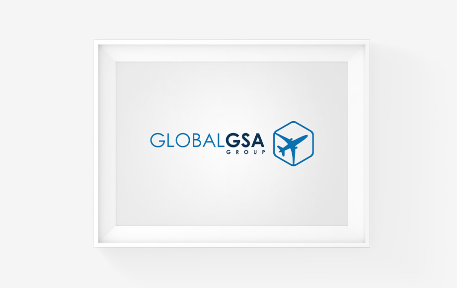
Logo – Global GSA Group
The Global GSA Group brand is our clients’ business’s identity, and it should be as consistent as the products or services they are offering.
The symbol is visualizing an airplane in a polygon, which creates the illusion of a carton box.
- Polygon: one of the strongest shapes and it is symbolized as the base of the company; Strong yet elegant.
- Airplane: air freight is the business of our client.
- Wings touch the polygon base: because based on the existing knowledge and experience the future course will be based on.
- Tail doesn’t touch the polygon base: because the company leaves bad experiences in the business behind.
- Nose doesn’t touch the polygon base: as the company always believe that there is always potential to grow and develop theirselves.
This concept is been used to rebrand all the 21 entities of Global GSA Group worldwide. See video